
Project Overview
The project, which was completed as a part of my UX design coursework, was to create a phone app and dynamic website for a public art museum to advertise exhibitions and events, to provide information to patrons, and to allow visitors to buy tickets.
The outcome of the project was a prototype of both a dynamic website and a phone app for The (fictional) Washington Museum of Fine Art.
For more details, please see the below case study slide decks, which were completed as a part of the course.
User Research
For user research, I relied on the sample users provided by the course. If this was a real museum I would have conducted interviews with museum patrons to understand their needs, and would also have conducted a survey to broadly assess their needs.
Creating user personas and journeys led me to focus on the events calendar function of the application, as this would likely be one of the most useful features for potential users.
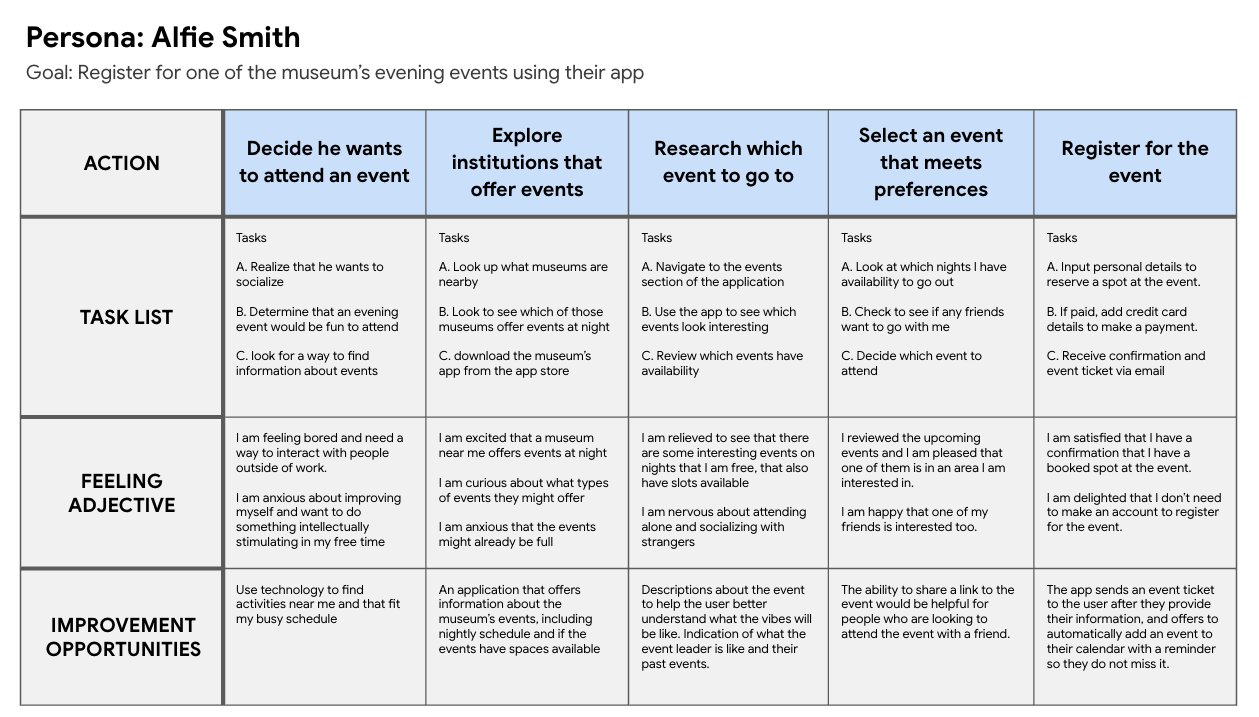
User Personas

Ideation
Paper Wireframes - Phone App


(I did this bit before learning how much better this goes with graph paper and a sharpie)
Digital Wireframes - Phone App


Iteration and Testing
Usability studies with the app yielded the following findings:
The lack of a page to review the event a user was registering for was jarring for users
Back buttons were missing in case you selected the wrong event
The calendar icon was not enough to signal that the location of the events list, so a text label was added
Usability studies with the website yielded the following findings:
Added the number of spots remaining in each event, so users could make more informed choices
Similarly to the app, the lack of a page to review the event a user was registering for was jarring for users
Navigation was improved to allow users to return to the previous page without returing the the homepage first
End Result


User Journeys
Paper Wireframes - Website


Digital Wireframes - Website


New confirm registration screen

Events calendar that includes indicators of how many spots remain in each event, in accent color for emphasis


Takeaways and Areas for Improvement
Mission creep was a real problem during the process. I wanted to implement many features including guided museum tours, language translation, exhibit overviews, and educational materials, but as a designer with limited experience these ideas fell by the wayside as I focused on the event registration function. In the future I would add these features back in.
User testing was crucial, as some assumptions that I had made about how users would navigate the app and the website turned out to be very misguided. In future projects I will do more user testing with prototypes to make sure that I am not waisting time on features or user flows that have fundamental issues.
If this was a real museum, stakeholders would have had a lot of input, and interacting with their users would have helped to provide more initial guidance in the beginning.
Have constructive feedback? Want to chat about this project? Please get in touch!